What's the problem?
Nielsen had dozens of tangled, legacy products, all with different UI designs, UX behaviors and different tech stacks. Our client services team was losing new business pitches, and we were also losing existing clients because our tools were outdated, arcane and cumbersome to use.
With a new corporate-level rebranding, and the launch of the Nielsen ONE suite, a trustworthy, reliable and unified design was clearly a priority. I took the initiative and led the way in creating a standard design language, defining common colors, icons, names and behaviors across all of our products.
How did I get started?
I was brought on board to design a new flagship application, Budget Planner. Originally, in the spirit of progressive disclosure, the rest of the team wanted to start by showing all media channels in a chart, and then have the client user drill down to the specifics they wanted.
When I asked the developers and product owners “What's the highest number of media channels a client can have?” they checked the data and came back with “24, but it could be more.”
Using our official color palette, this would have given me this hideous chart, which I referred to as “color salad” — not only repulsive-looking, but definitely not useful or accessible.
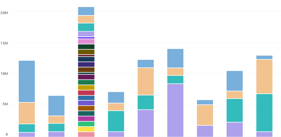
Asking the user to filter from the legend would be a mess. We would have to list 24+ channel names under the table, and the user would have to read all of them.
I was likely to run out of colors in our palette, and would have to repeat them. The visualization library used by the developers didn't allow for adding distinguishing textures or patterns, like dots or stripes.
Some bars might be tiny, making mousing over too challenging. Letting the user adjust the scale to zoom in would be a technical challenge. I didn't want to hide vital information that the user would need for their next step.
Detective work
I was puzzled why there were so many media channel names, so I checked out some of the actual data. Here's what I found in one example dataset:
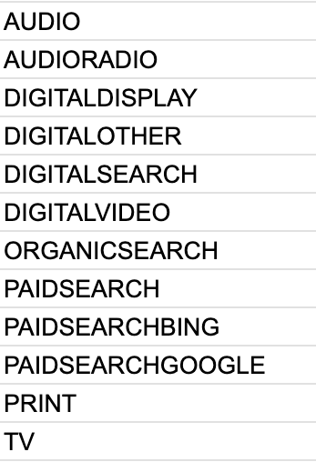
Yikes. The data was missing a top level master category, and was distressingly flat. Most of the channel names had been invented by a client (or by a Nielsen data analyst). Some of the names were just different categories smashed together, without spaces, with dashes, in different cases, and in reversed order. They were completely inconsistent across the board.
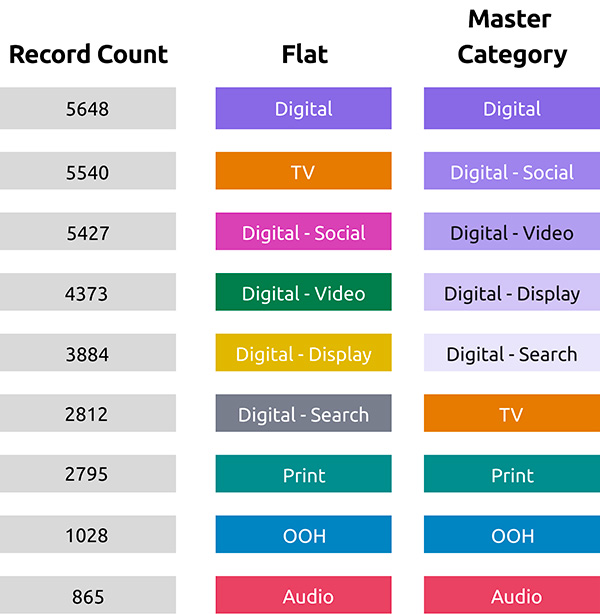
I wanted to build the data visualization using a much smaller number of master categories and then let the user zoom in and out. I could create a “Digital” master category that would contain the channels “Display,” “Search,” “Video,” and “Other.” The “Search” master category would contain the channels “Paid,” “Bing,” “Google,” and “Organic.”
Is it even possible?
I reached out to another team, Compass, which was focusing on making information architecture changes across the Nielsen ecosystem. They were enthusiastic about my idea of updating our datasets and standardizing the names. About 50% of datasets were able to support a master category.
I asked Compass for a list of all channel names, and cleaned them up, checking with different product owners to make sure I was categorizing correctly.
What would it look like?
Meanwhile, I discovered that the marketing team was already sending out donut charts like this:
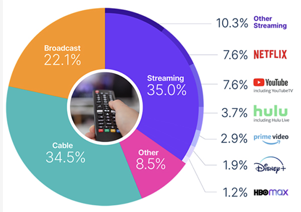
Our data was different, but we could follow this example, using the master category (i.e. “Streaming”) and then nesting all its channels underneath it, using accessible tints and shades of the master color.
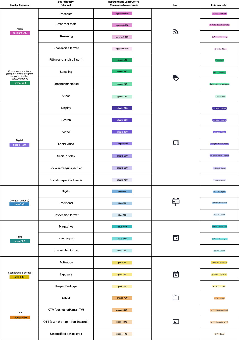
Which colors should I use? I ran a report to find out what the most common channels were across all our clients, and assigned a combination of accessible colors from the palette, defining contrast labeling and checking for color-blindness.
I built a Figma working library with examples of all the new colors, labels, icons, names, and chips...
..., and then I used a sample dataset to build a demo data visualization in d3.js.
Results
When everything was ready to go, I gave a presentation to engineering, product and UX directors and leadership. I made our needs clear, and everyone was super excited for the possibilities. Our next step was to budget free time from engineers to make the updates...

I did have a quick win right away. Since Budget Planner was a new application, and we could build it correctly from the start, I shared the Figma library with the developers so we could set a great example for all the other teams. I also made the changes instantly available to the other Nielsen ONE UX designers, so we could all be consistent moving forward.